UI/UX DESIGN
DXC Event Manager
Overview
This project involved a comprehensive redesign of a digital platform for a leading global drinking brand. The goal was to enhance the user experience and create a visually cohesive interface that aligns with the brand’s identity
My Role
UI Design
Design Systems
Prototyping
UX Design
My Team
Gabriella Ramirez
Associate Design Director
UX Designers
Duration
2 months
Tools
Figma
The Problem 🤔
Key areas within the event management platform were outdated, featuring inconsistent UI and lacking essential features. This made it challenging for users to navigate and utilize the platform effectively.
The Solution 💡
I focused on redesigning specific areas of the platform, enhancing the UI with a more cohesive design and adding new features to improve functionality.
Visual Direction
This moodboard was provided as the initial visual direction for the project. I worked off of these concepts to expand and refine the design for the Resource Hub,
Iterations
Working closely with my manager and the UX/UI team, I explored various design directions, incorporating feedback at each stage to ensure the final product met the needs of its users. These iterations allowed us to experiment with different layouts, color schemes, and interactions, ultimately leading to a more intuitive and visually cohesive platform.
Tab Navigation
Enhanced tab navigation by replacing buttons with tabs for quicker access to different data sets. Additionally, redesigned the empty state for tables to provide more context and guidance, with an accessible action button for adding files directly from the empty state
Improved Table Hierachy
Enhanced table hierarchy demonstrating responsiveness with the navigation panel, interactive hover states, and newly added features like sortable columns and action icons that appear on hover.
Side Panels
Redesigned side panels replacing full-screen modals with convenient, easily accessible panels featuring an enhanced design and dark mode. The file upload process now includes a drag-and-drop functionality,
Full Prototype Walkthrough
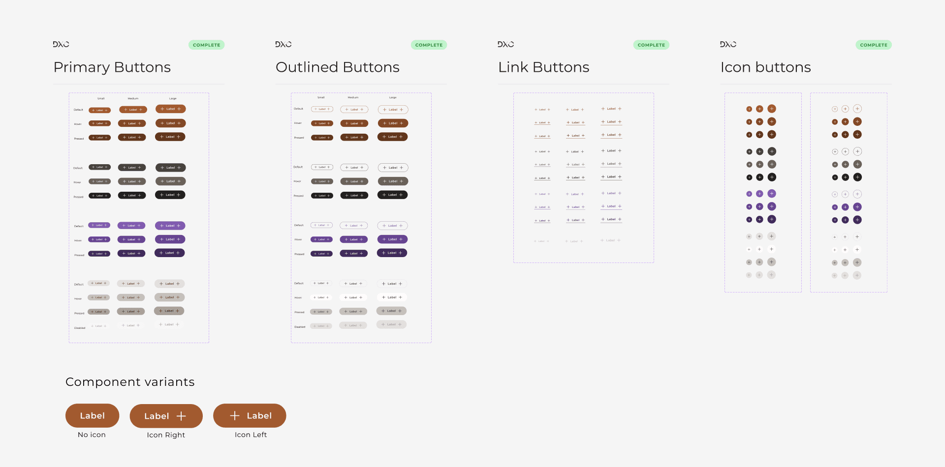
Design System
After exploring UI conceptual designs and prototypes, my team and I began developing the design system together. I focused on colors and buttons, learning about color accessibility and creating scalable button components.
Key Takeaways
Embracing Iteration
Regularly refining and testing designs led to more user-friendly and innovative solutions, highlighting the value of iteration in the creative process.Designing for Accessibility
Focusing on color accessibility and inclusive design ensured the final product was usable by all, emphasizing the importance of universal design principles.Building Scalable Systems
Developing a consistent design system allowed for easy scalability and ensured cohesion across the platform.Collaboration from the Start
Involving cross-functional teams early on ensured that content strategy, technical feasibility, and design were aligned throughout the project.Balancing Simplicity and Functionality
Simplifying the interface while maintaining robust functionality led to a more intuitive and effective user experience.